Xfinity
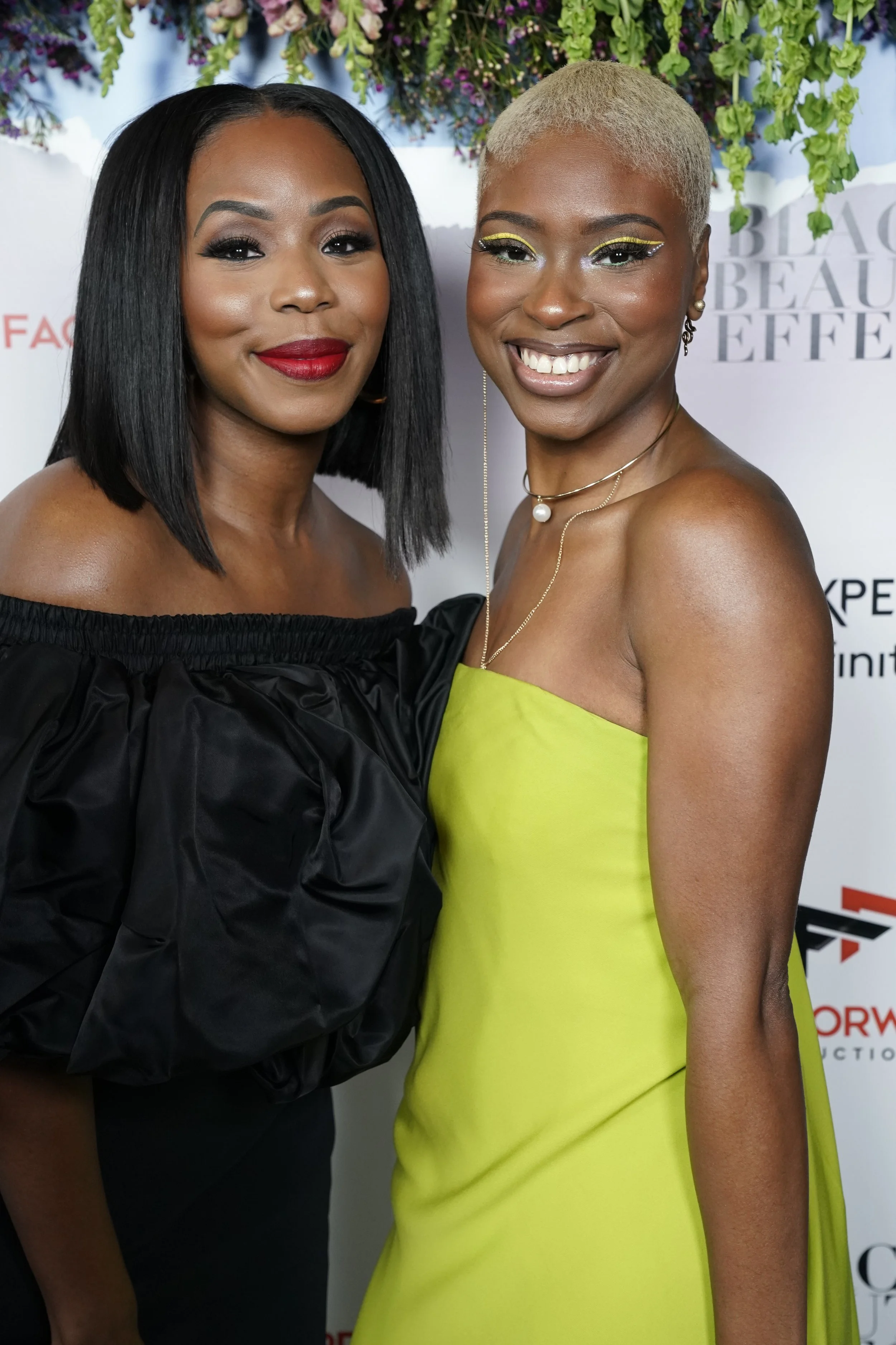
The Black Experience on Xfinity (BEX) | The Black Beauty Effect Premiere
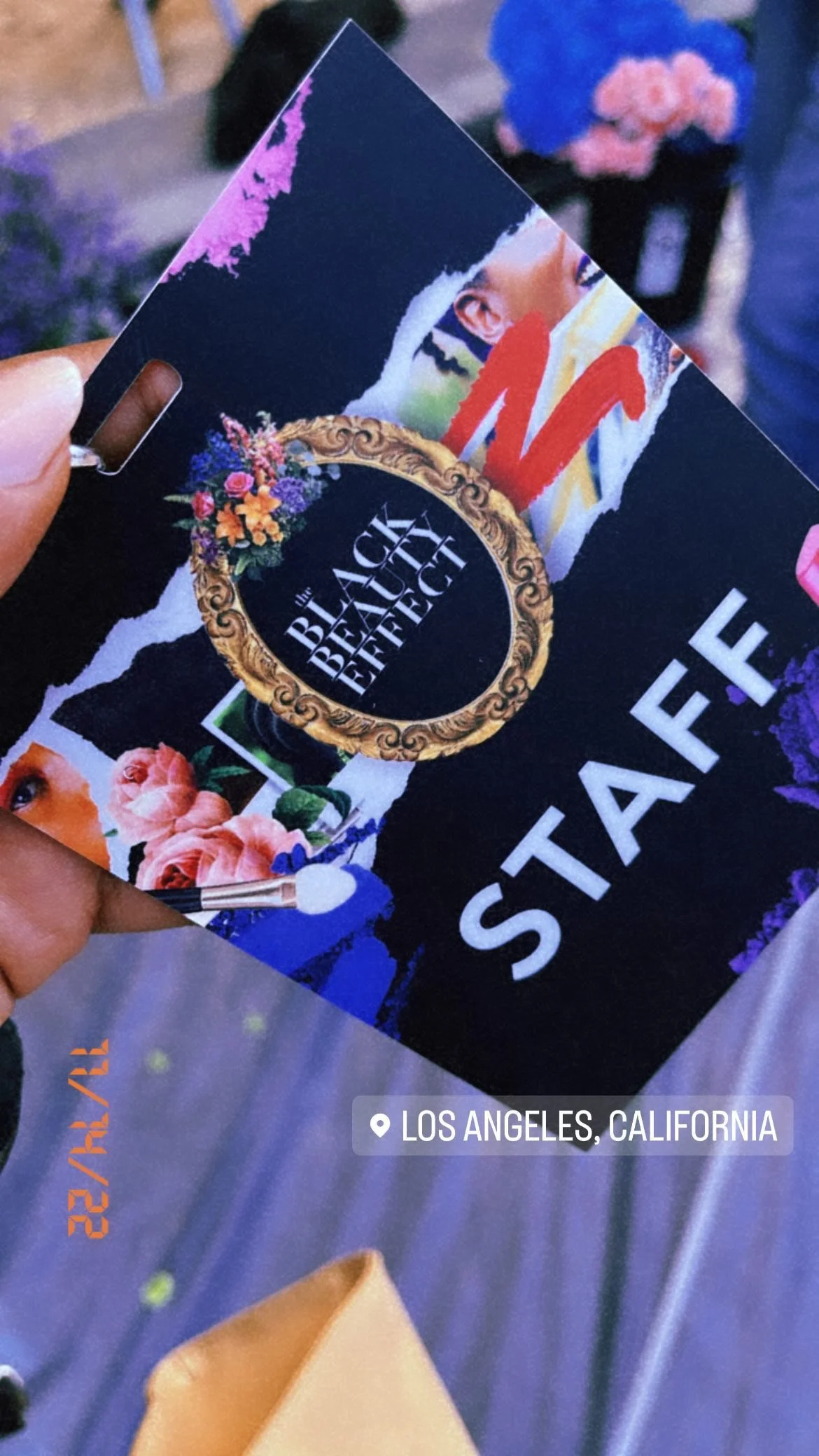
Launching a docuseries like The Black Beauty Effect required more than awareness.
It required embodiment.
As the first original docuseries from Xfinity’s Black Exerience initiative, the work needed to carry the weight of its message before the first episode aired. The challenge was extending the story beyond the screen and into an experiential event that felt aligned, intentional, and resonant.
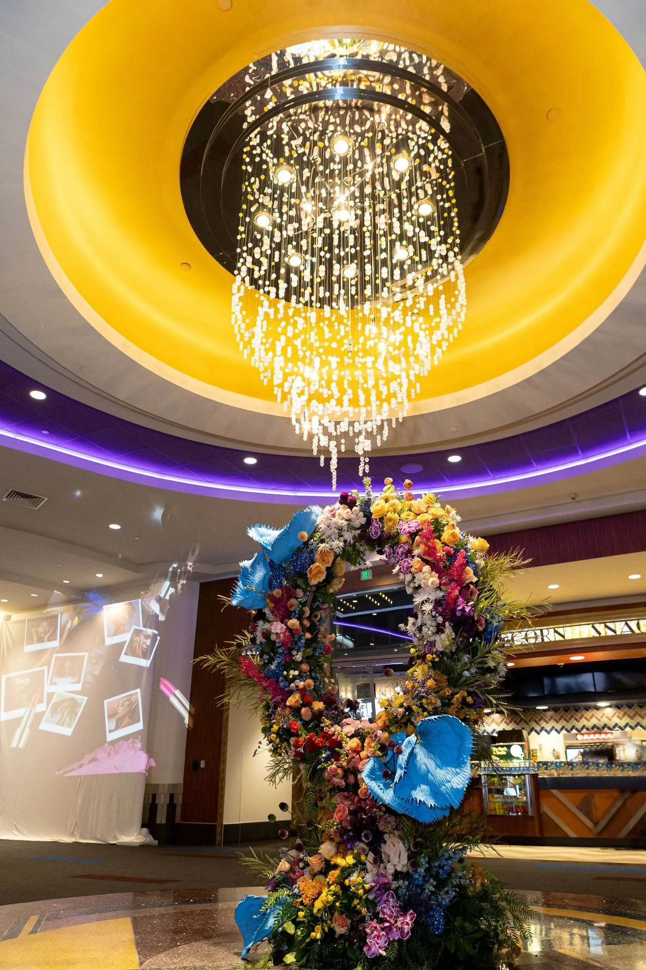
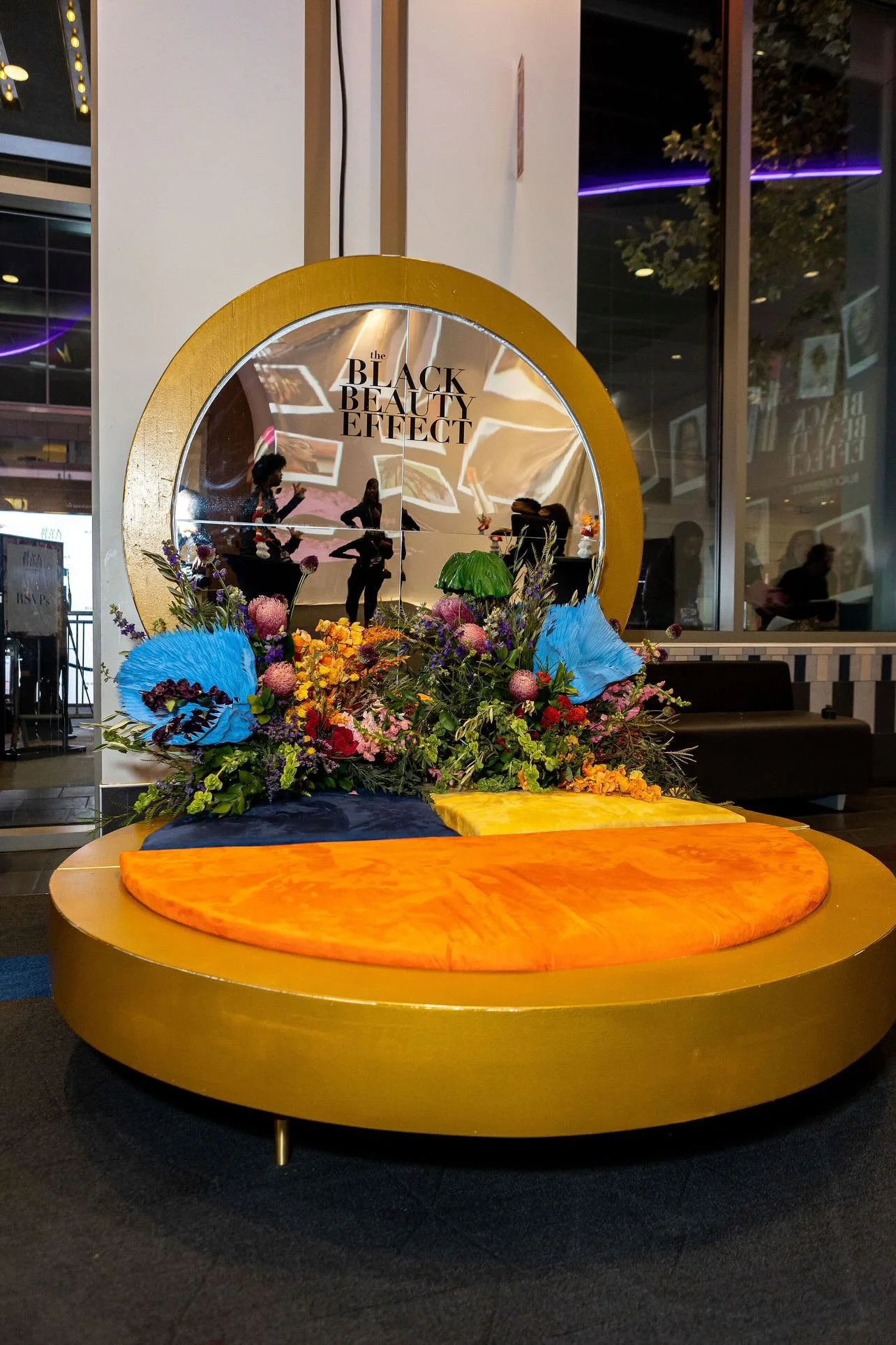
We translated the series’ narrative into an immersive premiere. Combining creative direction with copywriting to build a cohesive visual language that honored the spirit of the work rather than overshadowing it.
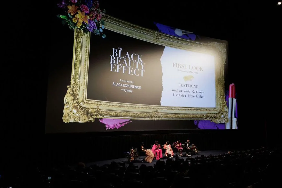
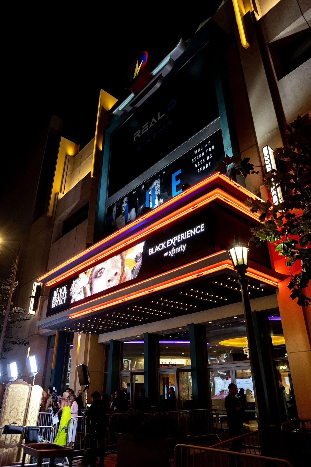
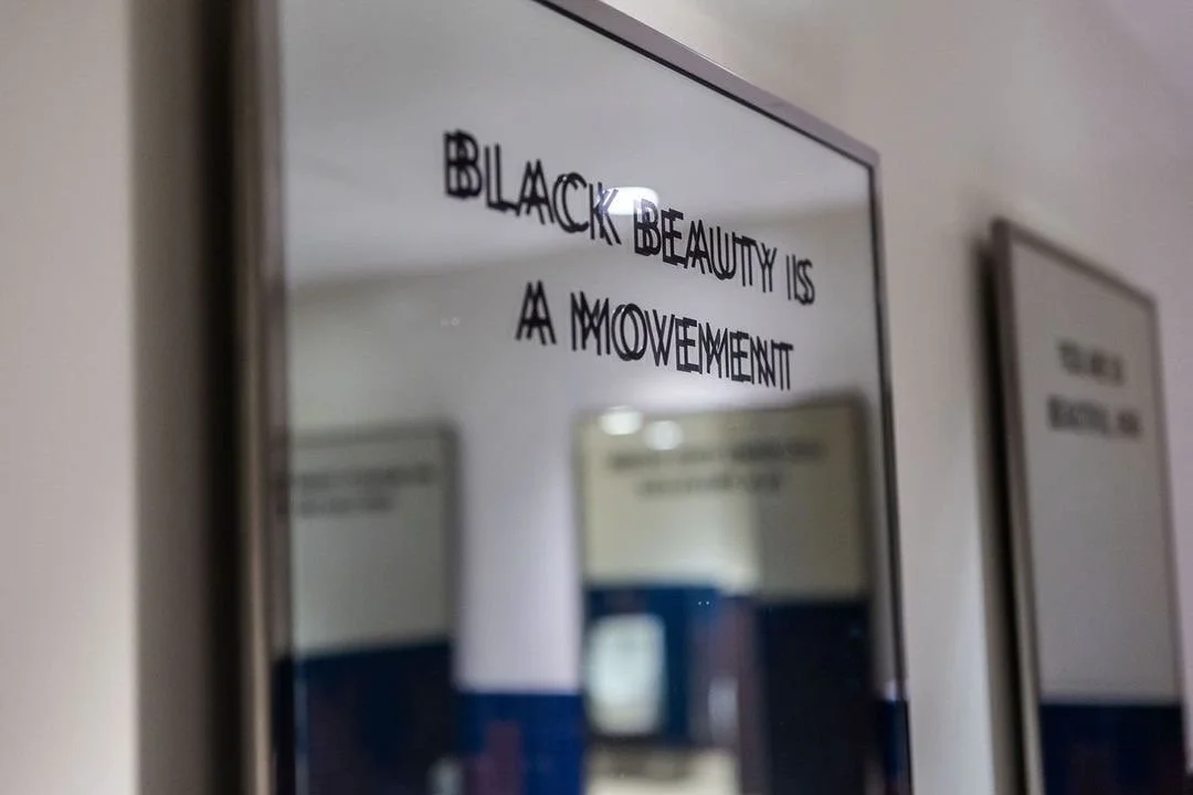
At the Regal Theatre in Los Angeles, the space was transformed using gilded frames, mirrors, florals, and affirmations. Each element was chosen to reflect the series' themes: beauty, recognition, and self-definition.
The experience reinforced the idea that beauty isn’t something to just observe. It’s something you recognize in yourself.
Agency: Burrell Communications
Creative Director: Claudio Garcia
Executive Producers (film): Andrea Lewis + CJ Faison